Example
Hey there,
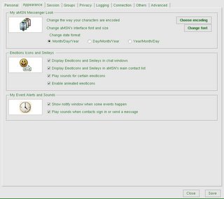
I thought I'd see how the new widgets looked in Amsn. This turned out to be a nice exercise in debugging as lots of problems came to light with the widgets that I wasn't aware of...putting the widgets into amsn is, I suppose, the best way of testing them to see if they match the tk ones. Anyway, I think I've squashed most of the bugs, and here's a screenshot to show how amsn can look with a bit of work. Bear in mind that all I've changed here is the buttons, checkbuttons and radiobuttons, giving them a clean gtk-ish theme. When I have completed the tabbed window widget that I have underway, the prefs window will look nicer still. (Although in the future it'll be using a mozilla prefs style widget).
Screenshot: (once again, blogger has changed the colour of the text...seems to be a hobby it has..)

One thing I noticed whilst testing the widgets in amsn was they slowed it down a bit. I will have to work on optimising them!
Tom
I thought I'd see how the new widgets looked in Amsn. This turned out to be a nice exercise in debugging as lots of problems came to light with the widgets that I wasn't aware of...putting the widgets into amsn is, I suppose, the best way of testing them to see if they match the tk ones. Anyway, I think I've squashed most of the bugs, and here's a screenshot to show how amsn can look with a bit of work. Bear in mind that all I've changed here is the buttons, checkbuttons and radiobuttons, giving them a clean gtk-ish theme. When I have completed the tabbed window widget that I have underway, the prefs window will look nicer still. (Although in the future it'll be using a mozilla prefs style widget).
Screenshot: (once again, blogger has changed the colour of the text...seems to be a hobby it has..)

One thing I noticed whilst testing the widgets in amsn was they slowed it down a bit. I will have to work on optimising them!
Tom


3 Comments:
At 6:01 AM, Anonymous said…
CAN'T WAITTTT! :P
At 2:51 PM, Anonymous said…
Great work man. Got all my moral support.
At 1:25 AM, Tom Jenkins said…
Thank you both for the commments :)
Post a Comment
<< Home